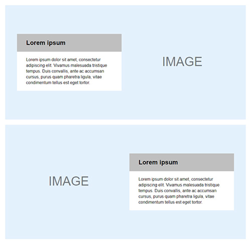
This technique is something I've been using/known about for a while, and it recently came into practice again in a project I'm currently working on. It got me thinking, i wonder if anyone else know's about this? Some probably do, but i'm sure there are enough people who don't. So here it is.
What's the use case
Sometimes a design requires some textual content to be placed over an image. Often the design itself looks super flashy and everything is great. That is until it's released into the wild, and who know's what sort of image will be used. Often these types of designs have the text content covering a non-important part of the image, with the remaining space being a focal point of sorts. In these scenarios it can be really useful to be able to flip the image so that the focal point is the the side that you want.

How is it done?
There are a number of ways to flip an image depending on how to want to flip it. All of them can be do using one property. transform
Here's what the default image we're going to work with looks like.

The code
Here's what the code for each flip loops like.
.flip-horizontal {
    transform: scaleX(-1);
}

.flip-vertical {
    transform: scaleY(-1);
}

.flip-both {
    transform: scale(-1);
}
Horizontal
.flip-horizontal {
    transform: scaleX(-1);
}
Vertical
.flip-vertical {
    transform: scaleY(-1);
}

Both
.flip-both {
    transform: scale(-1);
}

Caveats
As with many things in the land of code, there are some caveats to this approach, although they are fairly minor.
- Whilst transforms are supported in all modern browsers, some older ones will need a prefix caniuse.com/#search=transform
- If you need to support IE8 or below, it wont work (And i also feel for you).
I hope you find this useful, and if it's something you already knew, please share it with someone who may not, Thanks.